This snow storm and its forecasts are discussed in detail by Rich Grumm. Here we provide a retrospective analysis of the NCEP global ensemble forecasts with respect to their ability to indicate in real time the degree of uncertainty in the forecasts for the storm.
1) Grumm pointed out that until the 3rd March the
storm was not well predicted:
"From a long-range perspective, this storm was poorly forecast and
had a distinct trend to the north and west of
previous forecasts. But, by 3 March, the models had clearly converged
on a strong storm to impact the eastern United States. After 1200 UTC,
the forecasts really were in the realm of NCEPs short-term models and then
the devil was in the details."
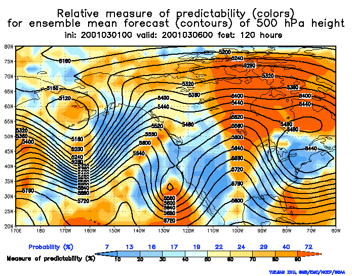
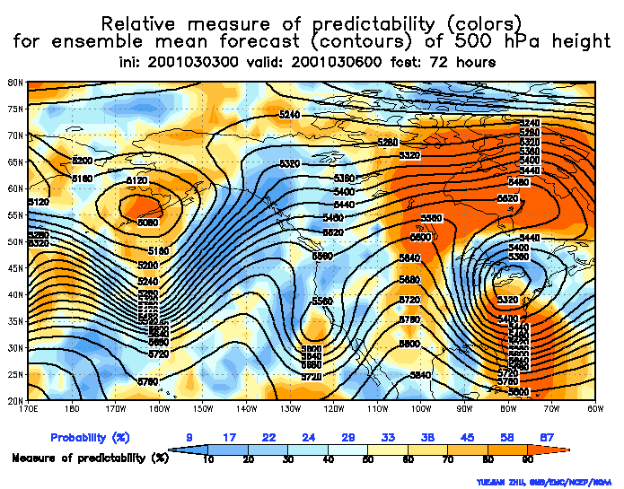
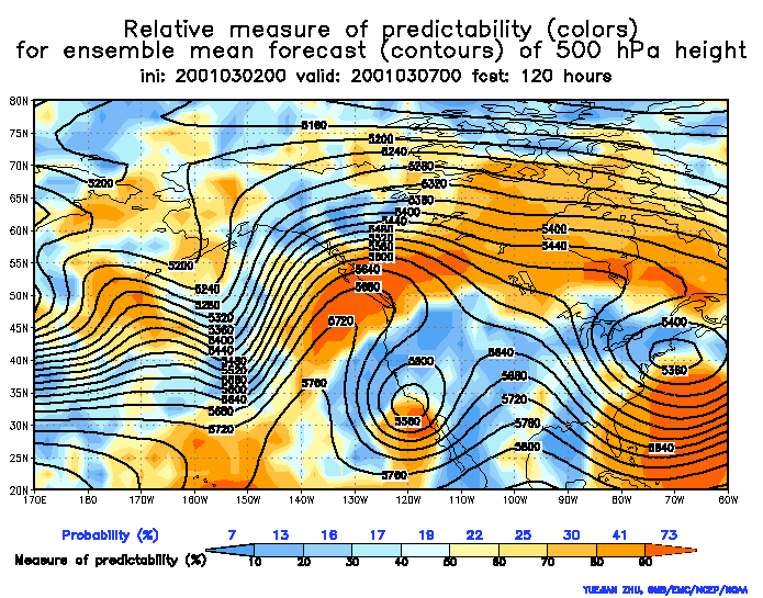
We can consider two figures for the "relative measure of predictability",
valid for 0306 00Z, one from the 1st March, showing
deep blue colors (low predictability) over the eastern coast states north
of 35 N, and the other from the 3rd March, showing
deep red color (high predictability) over the mid-Atlantic states (35-40N,
85-75W). So the real time guidance gave some indication of the expected
reliability of the forecasts. We should not have expected good forecast
performance before the initial time on the 3rd.
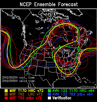
2) Another figure shows a 3-day 500 hPa height spaghetti
from the NCEP ensemble. Note that there was only
one or two member(s) (out of 14 perturbed forecasts shown) that gave
lower height values than the MRF or the lower resolution control. Nonlinear
effects within the ensemble thus indicated that errors in the initial condition
were more likely to make the wave shallower (as it happened) than deeper
in this case.
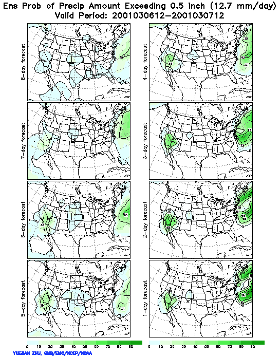
3) Another figure shows 24 hr Probabilistic Quantitative Precipitation Forecasts (PQPF) for the 24-hour period ending 0305 1200 UTC, with different lead times. The heavy precipitation over Pennsylvania was not really picked up by the forecasts until the 0302 initial time (marked as 3-day lead time) and the probabilities for the half inch were rather low until the 0304 initial time. Assuming for a moment that there was no systematic model error one could say that the precipitation event associated with the storm was not well predictable beyond 3 or 1 day lead time, depending on the error tolerance one has. Note that the Florida precipitation event was relatively well predicted even at longer lead times.
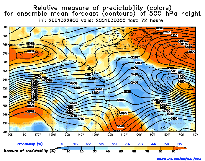
4) It is interesting to note that predictability was apparently much higher both before and after the storm affected the east coast. This is well documented by a series of relative predictability charts, each at 3-day lead time, initialized on 0228, 0302, and 0304. We can see the wave moving from the west to east, on the first figure (valid at 030300) associated with red color, then at 030500 with mainly blue color, then at 030700 again with red, suggesting relatively high predictability in the forecasts valid around 0303 and 0307, but low predictability in the forecasts valid around 0305 00Z. This is also evident (and was pointed out in real time by ZT) in the relative predictability charts initiated 030200 at 1-, 3-, and 5-day lead time. The trough in question is associated with probability values of 94, 38, and 73% respectively. Note also that PQPF forecasts valid for the period ending at 030312 and 030712 were more sharp (ie, displayed higher probabilities) and successful than those for the period ending at 030512.
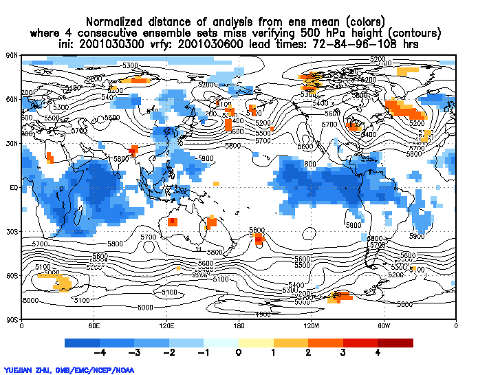
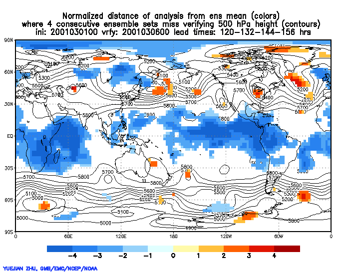
5) Note that the probability values on the relative measure of predictability
charts (but not yet on the PQPF charts) do reflect forecast failures due
to systematic model (or ensemble formulation) errors (as they occured in
the recent past). As for possible model errors in the forecasts for the
storm discussed, there is some indication that a flow dependent systematic
model error may also have been at play. We can look at a set of charts
indicating how consecutive, 40-member ensembles did or did not capture
the verifying analysis. Ensemble forecasts with 72,
120,
and 168 hrs lead time are shown here. At all
lead times a red area south of the Great Lakes appears, near the center
of the 500 hPa low. The red color means that all 40
ensemble members evalulated on a chart predicted higher height values
than the analyzed values. This happened
for 6 days in a raw, ie, all 120 ensemble members with 3 days or longer
lead time missed the analysis. This is not a proof but an indication for
possible model errors. Because the red colors appear only after 3 days
lead time and are not dark initially, the model error, if present, may
not be very serious.